Most Elementor pages are built from boxes. Cards sit in rows, images sit in columns, and after a while every services section looks like every other services section. A hexagon grid in Elementor is one of the quickest ways to break that pattern without making the page harder to read.
In this guide you will build a honeycomb style layout with the new Hexagon Grid widget (Pro), then add a Scroll Image Comparison (Pro) that reveals a before and after photo as the visitor scrolls. Both widgets arrived in Bright Addons Pro 1.9.0, and both are added in the Elementor editor like any other widget.
What you need before you start
- WordPress with Elementor installed.
- Bright Addons Pro for Elementor 1.9.0 or newer. It includes all 98 Pro widgets and every one of the 56 free widgets, 154 widgets in total.
- A few icons, images or short labels for your hexagons, and two matching photos (before and after) for the comparison.
Both widgets in this post are Pro. If you only want to try Bright Addons first, the free plugin has 56 widgets and runs on unlimited sites.
Where a hexagon grid works (and where it does not)

A hexagon grid is a design choice, not a default. It works best when each item is short and visual:
- Services or skills: one icon and one or two words per hexagon.
- Client or partner logos: a honeycomb of logos looks more deliberate than a plain logo strip.
- Process or features overview: six or seven hexagons that each name one step.
- Team or product teasers: one image per hexagon, with details on the next section or page.
It is a poor fit for long text. A hexagon has less usable space than a card of the same width, so a paragraph inside one will feel cramped. If each item needs a sentence or more, use a card grid or an Info Box instead and keep the hexagons for a short highlight row.
Step 1: Add the Hexagon Grid widget in Elementor
- Open the page in Elementor and add a container where the grid should go.
- Search for Hexagon Grid in the widget panel and drag it into the container.
- If you cannot find it, check that the widget is switched on in the Widgets screen of Bright Addons Pro.
The widget places the hexagons for you. Under the hood it builds a grid where the rows overlap by a quarter of a hexagon, which gives the classic honeycomb look. If JavaScript is slow or blocked, the items still show as a plain grid, so the content is never lost.
Step 2: Fill in each hexagon
Every hexagon is an item in a list, and each item can show one of three kinds of content:
| Content type | Best for | Tip |
|---|---|---|
| Icon | Services, features, process steps | Pair the icon with one short word |
| Image | Logos, team photos, products | Use square images so they crop evenly |
| Text only | Numbers, short labels, a call to action | Keep it to two or three words |
Each hexagon can also have its own colors. That is useful when you want one hexagon to stand out, for example a highlighted “Get a quote” cell in the middle of your services grid.
Step 3: Set the layout for desktop, tablet and phone
This is where the Hexagon Grid earns its place. You control:
- Hexagons per row, set per device. A common choice is 4 on desktop, 3 on tablet and 2 on phones.
- Gap, also per device, so the grid stays tight on small screens.
- Row pattern, which changes how the rows alternate to shape the honeycomb.
- Max width, which is 720 px by default. This keeps the grid compact on wide screens so it does not stretch into a thin band.
Start with the default max width, preview on all three devices with Elementor’s responsive mode, and only then change the per row count. A hexagon grid with too many items per row on a phone turns into tiny shapes that are hard to tap.
Step 4: Add hover effects and the pop in animation
The widget includes hover effects for each hexagon and a pop in effect that brings the hexagons in as the section appears. Use one of them with intent:
- On a logo grid, a soft hover effect is enough. Visitors are scanning, not clicking.
- On a services grid where each hexagon links somewhere, a clear hover effect tells visitors the shape is clickable.
- Use the pop in effect once per page at most. Several animated sections in a row make a page feel slow, even when it is not.
Step 5: Add a Scroll Image Comparison below it
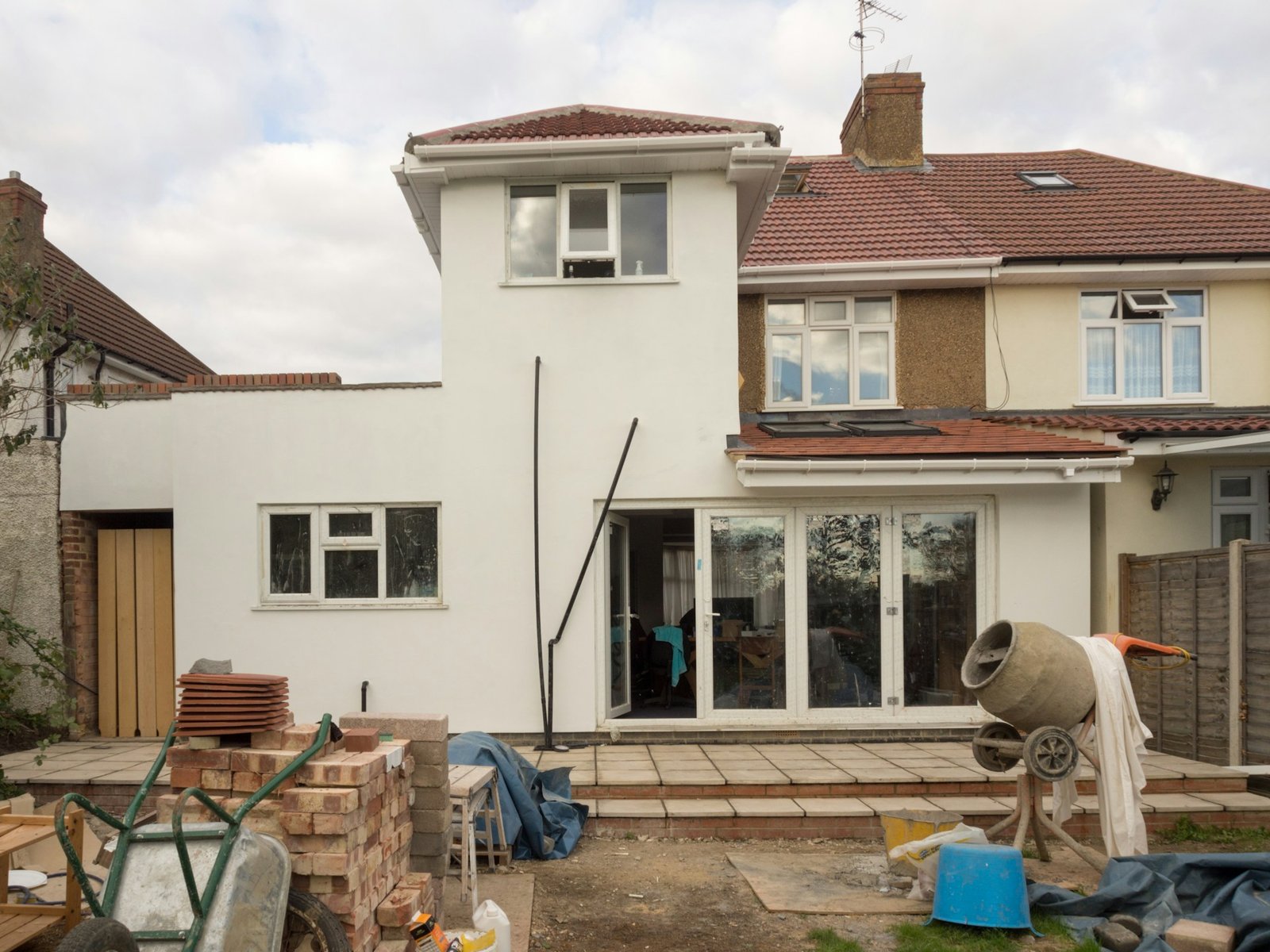
A classic before and after slider waits for the visitor to drag it. Many visitors never do. The Scroll Image Comparison widget (Pro) solves that: the divider moves on its own as the visitor scrolls down the page, so the “after” photo is revealed without any effort.
It suits builders, renovators, designers, photo editors, cleaning services, landscapers and any business that sells a visible change. To set it up:
- Drag Scroll Image Comparison into the section under your hexagon grid.
- Add the before image and the after image. Use photos with the same size and framing, or the reveal will look like a jump.
- Set the start and end percent for the divider, for example from 90% to 10%, so most of the after image is revealed by the end.
- Set the screen positions where the movement starts and ends, so the reveal happens while the image is clearly in view.
- Turn on smooth for a softer movement, and play once if you want the reveal to happen a single time instead of following every scroll up and down.
- Add labels such as “Before” and “After”, and style the handle.
Visitors can still drag the divider with a mouse or a finger, and it also works with the keyboard, which helps visitors who do not use a pointer. In the Elementor editor the divider rests at its start position, so you can see the before image while you design.
Make both widgets work on phones

Most visitors will see this section on a phone first. A quick checklist before you publish:
- Set 2 hexagons per row on phones and check that icons and labels stay readable.
- Reduce the gap on phones so the honeycomb does not spread too far apart.
- For the scroll comparison, use landscape photos that still show the change clearly when they are only about 360 px wide.
- Compress both photos and export them as WebP to keep the page fast.
- Scroll the page on a real phone and check that the reveal finishes while the image is still on screen.
A simple page layout that uses both
Here is one layout you can copy for a renovation, design or agency site:
- Hero with your headline and main button.
- Hexagon Grid with six services, each with an icon and one word.
- Scroll Image Comparison with your best before and after project.
- Testimonials or reviews from the same kind of project.
- Call to action with a contact form or booking link.
The hexagons say what you do, the comparison proves it, and the testimonials back it up. That order moves a visitor from “what is this” to “I want this” in three short sections.
Frequently asked questions
Can I build a hexagon grid in Elementor without code?
Yes. The Hexagon Grid widget in Bright Addons Pro builds the honeycomb layout for you. You add items, choose icons, images or text, and set how many hexagons sit in each row on desktop, tablet and phone.
Is the Hexagon Grid widget free?
No. Hexagon Grid and Scroll Image Comparison are Pro widgets, added in Bright Addons Pro 1.9.0. The free Bright Addons for Elementor plugin has 56 free widgets, including the Background Switcher and Image Scroller.
Does the scroll image comparison still work if the visitor does not scroll?
Yes. Visitors can drag the divider with a mouse or a finger, and keyboard users can move it too. You can also set it to play once, so the reveal does not repeat on every scroll.
Will a hexagon grid slow down my site?
The layout is placed by a small script, and the hexagons fall back to a plain grid if it does not run. Image size matters more: compress your images and use WebP.
Conclusion
A hexagon grid in Elementor is an easy way to make a services, skills or logo section look designed rather than templated, as long as each hexagon stays short. Pair it with a Scroll Image Comparison and you have a section that shows what you do and proves it, without asking visitors to click anything.
You can see both widgets on their pages: Hexagon Grid (guide) and Scroll Image Comparison (guide). Bright Addons Pro for Elementor starts from $10 a year during our Black Friday sale, which runs until Cyber Monday, 30 November 2026, with the discount already applied and no code needed. Every plan is on the pricing page and comes with a 14-day money-back guarantee.
Not ready for Pro? Start with our free plugins on WordPress.org: Bright Addons for Elementor (56 widgets), Bright Addons Blocks Library (62 blocks for the block editor) and Bright Addons for WooCommerce (28 store modules). Browse every widget on the widgets page.