You drag a new container onto the page and Elementor asks a small question with big consequences: Flexbox or Grid? Most people click whichever one they used last time. Then they spend twenty minutes fighting widths, gaps and a mobile view that refuses to behave.
This guide settles the Elementor Flexbox vs Grid container question in plain English. You will learn what each container actually does, when to pick one over the other, and how to combine both so your pages stay tidy on every screen size.
The short answer
Use Flexbox when your content flows in one direction, either a row or a column, and the items should size themselves around their content.
Use Grid when your content needs to line up in rows and columns at the same time, like a gallery, a set of cards or a pricing table.
Elementor’s own help center gives the same advice: choose Grid containers over Flexbox for complex, automatically responsive multi-column layouts. Everything else is detail, and the detail is what saves you time.
What a Flexbox container does
A Flexbox container arranges its children along a single line. You choose the direction (row or column), then decide how items are spaced along that line and how they align across it.
The controls you will use most:
- Direction: row, column, or the reversed versions of each.
- Justify Content: how items spread along the main direction (start, center, end, space between and so on).
- Align Items: how items line up on the other axis.
- Gaps: the space between items, without touching margins.
- Wrap: whether items drop to a new line when they run out of room.
Each child also gets its own flex settings under the Advanced tab, including order, align self and size (grow, shrink or a custom value). That is the real strength of Flexbox: every item can behave a little differently.
Flexbox is content first. A button with a long label takes more room than a button with a short one, and the layout adapts. That makes it ideal for headers, navigation bars, button groups, icon and text pairs, hero sections and any block that simply stacks from top to bottom.
What a Grid container does
A Grid container works in two directions at once. You define the tracks first (how many columns, how many rows) and the children drop into the cells automatically.
The controls that matter:
- Columns and Rows: set a number, or switch to custom values. The
frunit shares the free space, so three columns of1frare always three equal columns. - Gaps: separate values for column gap and row gap.
- Auto Flow: whether new items fill row by row or column by column.
- Justify Items and Align Items: how content sits inside each cell.
- Grid Outline: a helper overlay in the editor that shows the cells while you build.
Children can also span more than one cell. Select an item, open Advanced, and set its column span or row span. That is how you build a magazine style layout with one large feature card beside four small ones.
Grid is layout first. The cells exist whether the content is long or short, so everything lines up. That is what you want for galleries, feature card sets, team sections, logo walls and product listings.
Elementor Flexbox vs Grid container: side by side
| Question | Flexbox container | Grid container |
|---|---|---|
| How many directions? | One (row or column) | Two (rows and columns together) |
| What drives the layout? | The content size | The tracks you define |
| Equal columns | Possible, needs width or grow settings on each child | Built in with fr units |
| Items with different sizes | Easy, per-item grow, shrink and order | Possible with column and row span |
| Changing column count on mobile | Wrap plus per-child widths | Change one number per breakpoint |
| Best for | Headers, button rows, hero sections, stacked content | Galleries, card sets, pricing tables, logo walls |
When Flexbox is the right pick
Reach for Flexbox when any of these is true:
- The items are different sizes on purpose. A logo on the left, a menu in the middle and a button on the right is a classic Flexbox row with space between.
- You need to push one thing away from the rest. Flexbox makes “everything left, one item right” a single setting.
- The section is a simple stack. A heading, a paragraph and a button in a column needs nothing more.
- You want to reorder items on mobile. The order setting on each child lets the image jump above the text on phones without duplicating content.
When Grid is the right pick
Grid earns its place when:
- You are repeating similar items. Six service cards, nine portfolio images or twelve client logos all want equal cells.
- Rows must line up. In a wrapped Flexbox row, each line sizes itself. In a Grid, the columns stay aligned from the first row to the last.
- The column count changes by device. Four columns on desktop, two on tablet, one on mobile is three numbers in a Grid container. In Flexbox it means editing the width of every child.
- One item should be bigger than the others. Column and row span handle that without extra wrappers.
Use both: Grid outside, Flexbox inside
The best layouts rarely choose one. A common, reliable pattern looks like this:
- The page section is a Flexbox column that stacks a heading, an intro and the content area.
- The content area is a Grid with three equal columns.
- Each card inside the Grid is a small Flexbox column holding an icon, a title, some text and a button.
Grid decides where the cards go. Flexbox decides how the content inside each card behaves. For example, setting the card to a column with space between pins every button to the bottom, even when the text lengths differ.
Common mistakes to avoid
Nesting too deep. Containers were introduced to cut down on wrapper elements. If you have a container inside a container inside a container holding one heading, flatten it. Fewer elements means a lighter page, and page weight is one of the things we covered in our guide to speeding up a slow Elementor site.
Using margins instead of gaps. Margins on individual widgets break the moment you reorder them. Set the gap on the parent container once and every child follows.
Fixed pixel widths in a Flexbox row. Three children at 380px each look fine on your monitor and overflow on a smaller laptop. Use percentages or let the items grow.
Forcing a gallery into Flexbox. If you are calculating “33.33% minus the gap” for each item, you are doing by hand what Grid does for you.
Forgetting the tablet view. A four column Grid that jumps straight to one column on mobile often looks cramped on tablets. Check all breakpoints and set two columns in between.

A simple workflow you can follow
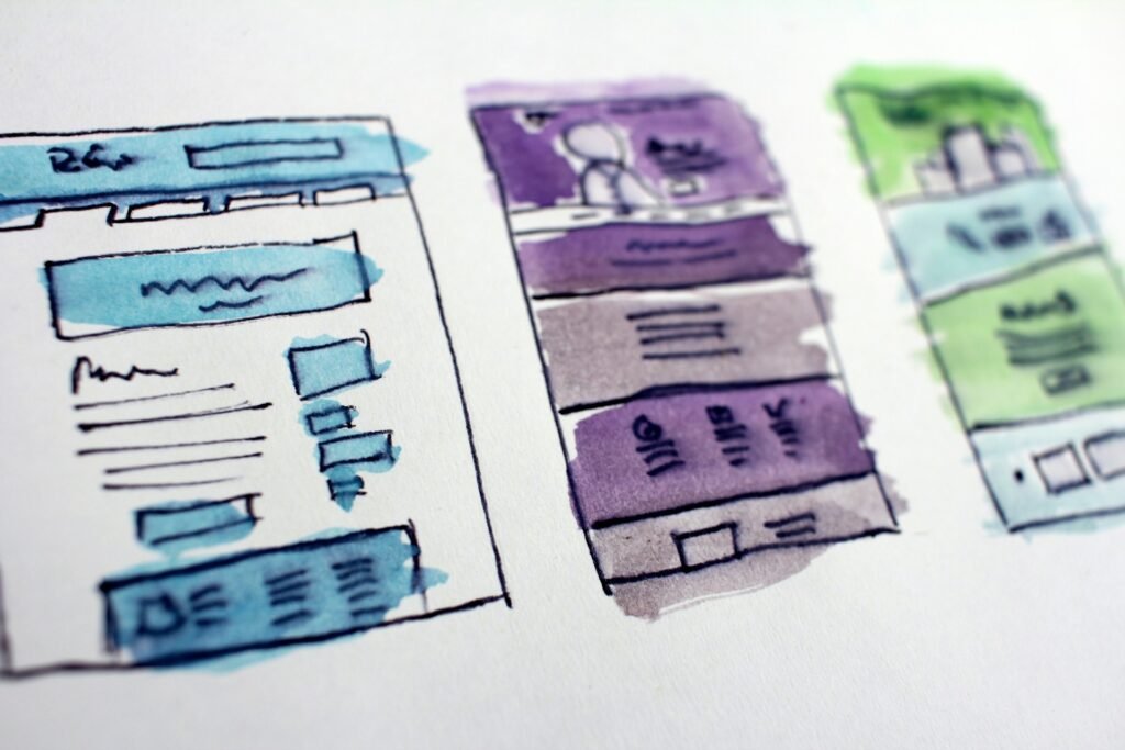
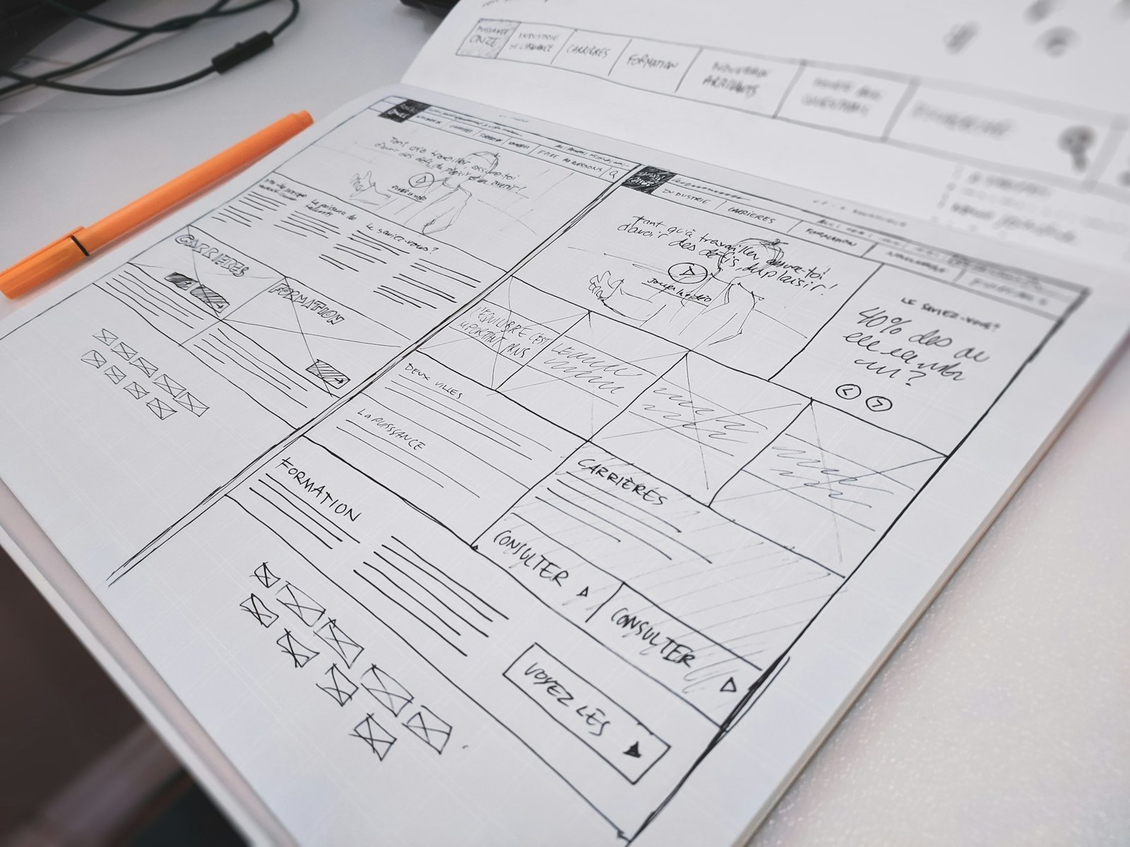
- Sketch the section on paper. Count the directions. One direction means Flexbox, two means Grid.
- Add the outer container and set its gap before adding any widgets.
- For Grid, set the column count for desktop, tablet and mobile straight away.
- Build one card or item completely, then duplicate it.
- Preview every breakpoint before you move to the next section.
Five minutes of planning here saves an hour of nudging padding later.
Where widgets fit in
Containers control where things sit. Widgets control what those things are. A well planned Grid filled with consistent cards looks professional almost by default, which is why ready-made widgets pair so well with container layouts.
Bright Addons is built for the container workflow. The free version includes 20 widgets and Pro adds 60+ more, so you can drop pricing tables, info cards, team members and similar blocks straight into a Grid or Flexbox container. You can browse the full list on the widgets page, and the docs show how each one is set up. If you later need the Pro set, plans start at $19 per year with a 14-day refund.

Frequently asked questions
Is Grid better than Flexbox in Elementor?
Neither is better overall. Grid is better for two-dimensional layouts such as galleries and card sets. Flexbox is better for one-directional layouts such as headers, button rows and stacked content. Most pages use both.
Can I put a Flexbox container inside a Grid container?
Yes. Each cell of a Grid can hold a Flexbox container, and this is the most common pattern for card layouts. You can also place a Grid inside a Flexbox section.
Does a Grid container slow down my site?
No. Both container types output modern CSS that browsers handle very efficiently. What slows a page down is unnecessary nesting, heavy images and too many scripts, not the choice between Grid and Flexbox.
Should I still use sections and columns?
For new pages, containers are the better choice. They produce less markup and give you far more layout control. Existing pages built with sections and columns keep working, so you can convert them gradually and test as you go.
Final thoughts
The Elementor Flexbox vs Grid container choice comes down to one question: is your content flowing in one direction or two? One direction, use Flexbox. Two directions, use Grid. For anything more complex, let Grid place the pieces and let Flexbox arrange what is inside them.
Get that habit in place and your layouts become faster to build, easier to maintain and far more predictable on mobile. Then fill them with good widgets, and if you want a head start, the free Bright Addons pack is a simple place to begin.